After refining our vision and values, it became clear that our old website (which wasn’t actually that old!) no longer represented who we are.
It wasn’t just about updating the design—it was about ensuring our website aligned with our core values: being eco-led, user-led, and client-led (us being the client, achieving that one was easy!).
We needed to rethink everything, from content and structure to how we use images and animations.
The result? A website that reflects our commitment to the principles we advocate for in our work: sustainability, usability, and accessibility; and built using the same techniques we apply to client projects.
How our website reflects our values
Reducing our digital footprint (being eco-led)
Why we want to be eco-led.
After seeing the impact of global change in New Zealand and around the Pacific, many businesses, like ours, and individuals are taking steps to reduce their environmental impact, but many haven’t thought about the environmental impact of their digital marketing – and a website is often the main asset they have.
We think about the ecological impact of every design and code decision when we build websites – from elements like content, images and animation, to our plugin and hosting choices.
How we did this on our own website.
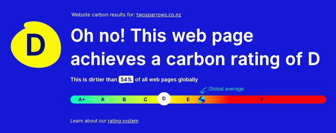
When we tested our old WordPress website homepage using the Website Carbon Rating System (a Sustainable Web Design collaboration initiative), the results were sobering. It achieved a Carbon rating of D, meaning it was dirtier than 54% of all web pages globally:
So, to make our own website more eco-conscious, we
- worked with a copywriter (Katrina Pace at Collected Copy) to refine and optimise our content,
- redesigned the site, being conscious of the impact each decision could have on efficiency,
- streamlined our code and theme,
- optimised all images and animations,
- were ruthlessly selective in our plugin choices
- and removed unnecessary elements to reduce energy consumption.
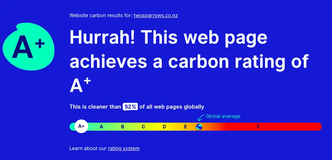
The results speak for themselves: our website homepage now achieves a Carbon rating of A+, meaning it’s now cleaner than 92% of all web pages globally.
Some might ask, why does this matter? (We’ve covered this in more detail in this blog about whether building eco-conscious websites really makes a difference.) Put simply, a website with a lower carbon footprint is not only better for the environment, but also faster and more efficient.
A lighter, well-optimised site means better performance, and that directly benefits both users and search rankings.
This shift aligns with our eco-led approach, ensuring our digital footprint is as light as possible without compromising on functionality or design.
Now our website (still built in WordPress) is a good example of sustainable web design.
Designing for accessibility and ease of use (being user-led)
Why we want to be user-led.
We want everyone who visits your website to have a positive experience, so we keep them in front of our minds as we design. A good experience means that your potential customers or clients are more likely to interact with you and help you grow your business.
We strive to make our designs consciously inclusive of those who interact with them, whether through language, accessibility, or functionality.
How we did this on our own website.
Website accessibility isn’t just about ticking boxes—it’s about ensuring a seamless experience for people with diverse needs. Therefore we’ve been investing time in improving our understanding of accessibility and how our website might be used by users with diverse ways of interacting with online content.
A big thanks to Planit, who we consulted with at the beginning of this year and who helped us learn a great deal about best practices for making websites more inclusive.
We’ve made improvements across multiple areas, including:
- Thoughtful colour combinations for readability
- Improved code structure for screen readers
- Clear labeling and strict use of heading hierarchies for better navigation
This was a significant shift for Imelda as a designer, but one of the big things we’ve learned is that accessibility should never be an afterthought or tacked on to the end of a project. It needs to be integrated into the design process from the beginning if it’s going to be effective.
By prioritising usability, we’ve stayed true to our user-led value. Our new site is easier to navigate, loads faster, and provides a better overall experience for everyone.

So, what do you think of our new website?
We really want to hear from you. How easy is our new website to use? Have we missed anything? Is there something you think we’ve done particularly well?
Your feedback helps us improve—so let us know your thoughts!
And if you want the same for your website, check out what we can offer you.